
Three WatersBranding over 300 new apartments in the heart of London’s fastest growing area
Triple the tranquility
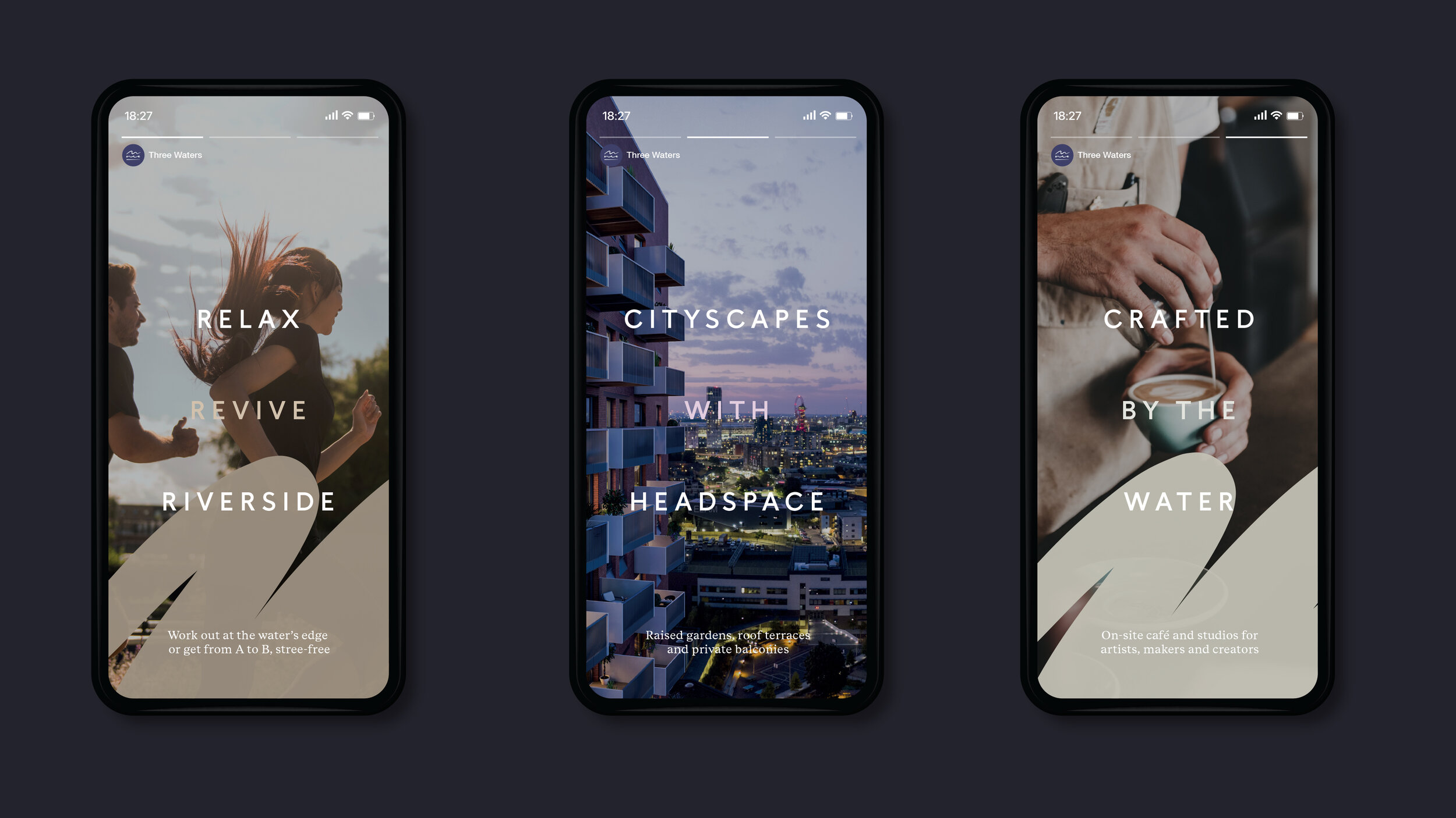
Built at the intersection on Bow Creek, the River Lea and the Limehouse Cut, Three Waters combines city living with a waterside lifestyle. Raised gardens, roof terraces and private balconies offer cityscapes with headspace and with the Tube and DLR moments away, residents can enjoy Zone Two living with Zone One journey times. We defined the name, strategy, branding and advertising for this new east London development from Mount Anvil and Peabody.
Sectors: Property, Place and destination
Services: Research and analysis, Stakeholder engagement, Brand story development, Visual identity development, Guidelines and artwork, Brand implementation
“Set in a relatively unconsidered area of east London, Three Waters – through its brand identity and storytelling – is now helping to shift perceptions of a once unloved area of the city. Its design is standout and considerate of its context.”
Sophie Spooner, Marketing Communications Manager
Crafted by the water
The brand identity centres around a calligraphic mark made with ink and water. The three lines represent the characteristics of each waterway that surrounds the development. The tidal ebb and flow of Bow Creek, the meandering path of the River Lea and the man-made solitude of the Limehouse Cut. The identity is supported by hand rendered calligraphic elements, used for illustrations and infographics, reflecting the movement of water.
A neutral colour palette of earthy tones and concrete grey is a nod to the development’s unique location. Highlights in bright red reference the London red brick of the development’s architecture, whilst a bespoke suite of icons combine style and functionality.

Minutes from the City.
Metres from the water.
The visual identity is underpinned by the core proposition ‘Minutes from the City, metres from the water’. This is accompanied by a suite of creative headlines such as ‘crafted by the water’, and ‘close to the City, connected to the world’. The branding comes together in the brochure design, which is divided into three sections through a bespoke tab system. A second shorter brochure was created to give a snapshot overview of Three Waters.
We art-directed a photoshoot and brand film to capture the quality of life that living by the water offers, whilst also reinforcing that key central London landmarks and business centres are just minutes away.


Inspired by history.
Made for the future.
We worked with the in-house team at Mount Anvil to ensure consistent application of the brand across the globe, from the UK marketing suite to launch events in Asia. Comprehensive brand guidelines serve to protect the new identity system and today, creating a strong foundation for the brand.
During its launch period, over a third of the apartments were sold. The brand contributed to a renewed interest in the area for journalists, with coverage in The Telegraph, Evening Standard and City AM, promoting positive conversations and sentiment of the area


