Understanding brand language: The science behind Cancer Research UK's brand success
Here at Lantern, we're passionate about the importance, and impact, of language and tonality on brand standout. So much so, that we've defined our entire business by it. But to fully understand attitudinal effectiveness, it helps to look at best practice examples. One benchmark from the charity sector that continues to inspire us, is Cancer Research UK. Originally rebranded by Interbrand in 2012, the organisation consistently provides tonal impact in a noisy, challenging and competitive market.

Cancer and donations: A growing problem
Cancer Research UK underwent a brand overhaul with the primary aim of increasing donations to fund its scientific research into the disease. Despite the increasing prevalence of the condition, the previous messaging didn't emphasise the science, resulting in a static level of donations funding an ever increasing level of research.
Aside from a need to increase the clarity and understanding of the charity's aims, a brand audit also noted that the organisation wasn't seen as bold or brave enough in its positioning as the enemy of cancer, nor did it achieve enough stand out in a crowded market.
An overhaul was undertaken at a total cost of £680,000 – a sum that included the initial design development as well as a full-scale national rollout.
Clearer on the outside, clearer on the inside
The rebrand was announced in August 2012 and revealed a new logo and look and feel, alongside clearer messaging and a much stronger tonality. The refresh promptly positioned research as cancer's greatest enemy – a core idea that went on to inform a rallying-cry of tonality across advertising, marketing and internal communications. It'a a technique that has continued to be applied since launch and one that has grown in terms of attitude over the past two and a half years.
Interbrand's initial tonal development for the brand:


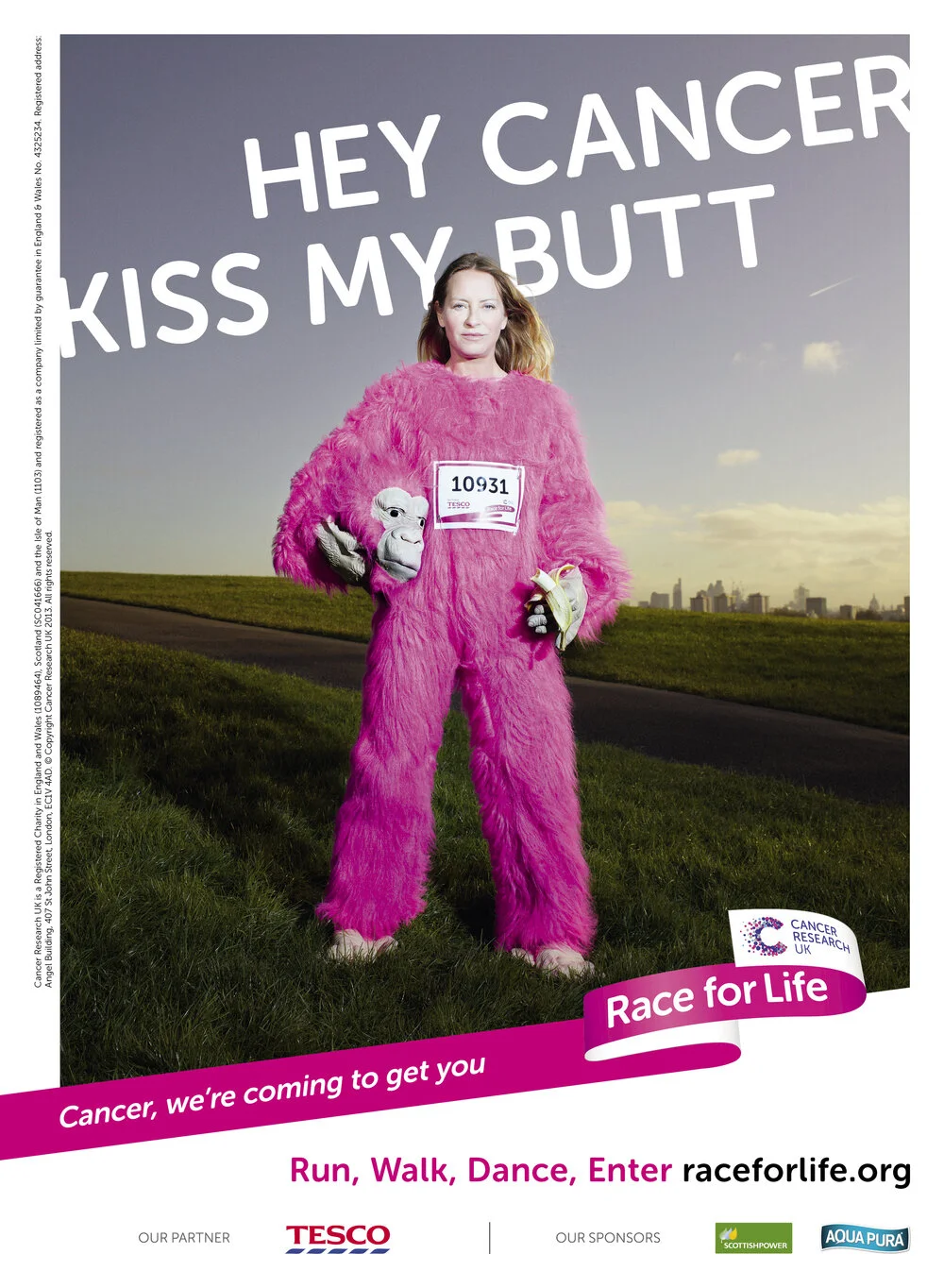
Recent communications continue the provocative approach, but have a sharper attitude, particularly with regard to the flagship 'Race For Life' campaign:

Raising the profile, raising revenue
The compelling idea to unite scientists, fundraisers, sufferers and families against one common evil not only gives the brand powerful standout in the crowded third sector, but it also empowers those affected by the disease.
By having a clear core message, forged in the simple brand truth of one day beating cancer, the charity instantly made it clearer for consumers to understand where their money was being spent: on finding a cure.
Despite the messaging, the brand launch proved controversial due to the six figure sum paid for the work. But over two years on, was this money well spent? The overwhelming answer is yes.
The only way to truly understand the impact that attitude, aesthetics and clearer messaging can have on a brand is to examine evidence after launch. Since implementation in 2012, Cancer Research UK has witnessed the following, powerful results:
6% increase in donations in 2013-2014, the year following launch
£29 million in additional revenue – far greater than the original design and marketing spend
Voted 11th most loved brand for people ages 18-24 in the UK – the highest performing charity
30,000 Facebook fans in the week after launch
The rebrand was indeed supported by several nationwide, advertising campaigns but the golden triangle of attitude, aesthetics and clear messaging ensured when the brand started speaking, people stopped, listened and donated.
With an overall implementation cost of 0.2% of revenue, resulting in a 6% increase in donations, it's clear that the rebrand was an investment worth making.