ALTERNATIVE AIRLINESEasy booking,
no turbulence
Sectors – Technology, Travel
Services – Brand strategy, brand story, brand identity
THE BRIEFTo become the world’s preferred choice for flight bookings
Alternative Airlines is a leading online flights-only booking company. The company exists to undo the complexity of the booking process, enabling customers to ‘book a flight without the fear’ – a common experience for many people making one of the biggest purchases of their year.
With a strong emphasis on ease and flexibility, Alternative Airlines provides various payment options, unrivalled choice with the most routes and airline options and a highly rated human customer care team ready to assist with amendments or support at any stage of the booking process.
We helped redefine the company’s strategic positioning and visual identity.


THE STRATEGYFreedom to fly.
When did booking a flight become the most stressful part of a trip? You hover over ‘Book now’ and hope for the best. Did I book the right baggage? When do I choose my seats? Can I even afford to fly so soon? The website gets more complex with every click.
Our new strategy challenges this convention, positioning the brand as the alternative by name and nature. By offering customers more choice, more flexibility and more alternatives, flight bookings come without the emotional baggage and travel comes without the turbulence. Alternative Airlines exists to give everyone, everywhere, the freedom to fly.


SOLUTIONHere for your journey.
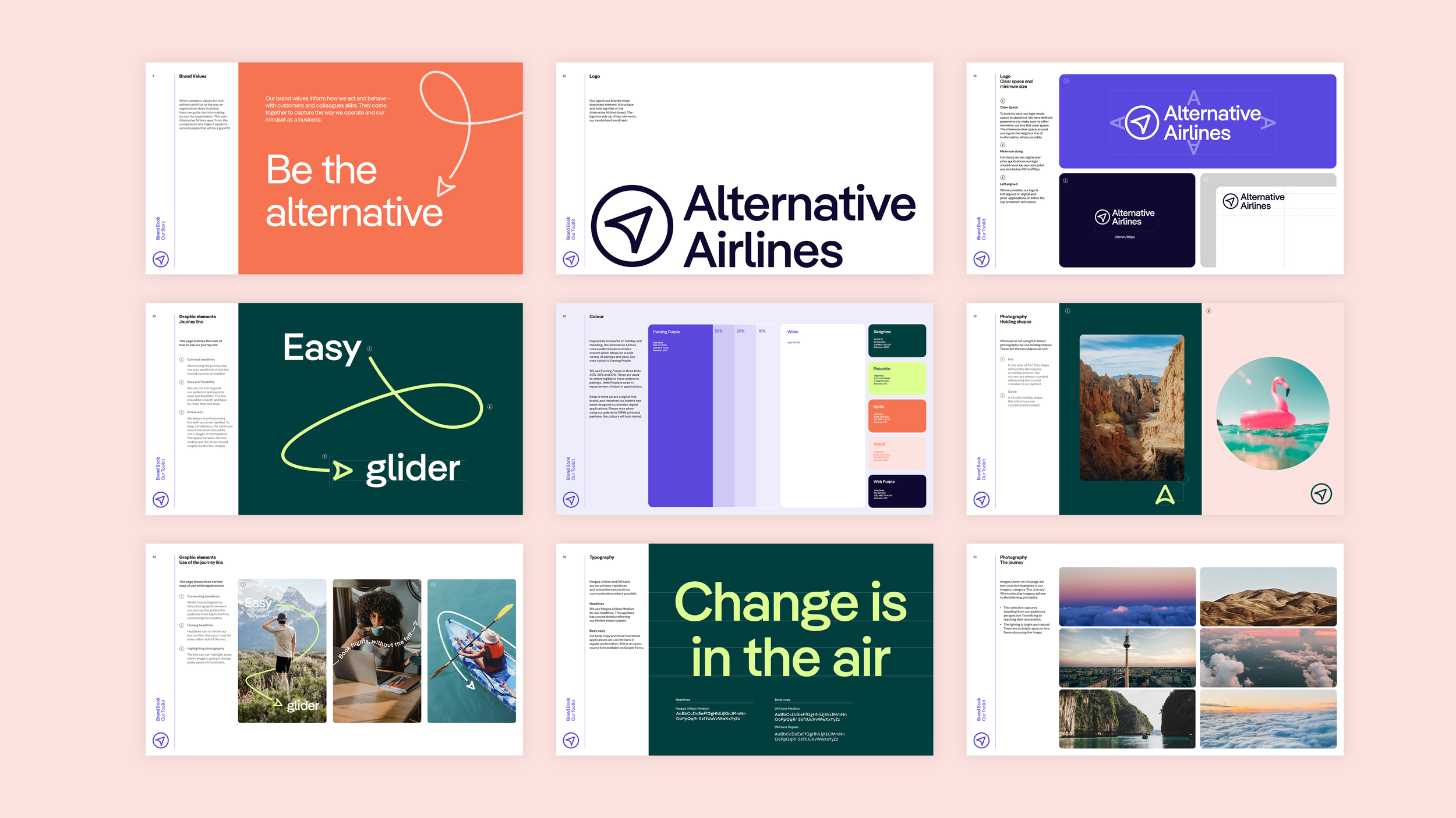
We created a guiding arrow symbol that sits both with a new wordmark and as a standalone asset. It combines an ‘A’ from the brand name, a compass dial - highlighting the breadth of destinations available and an online cursor reinforcing the online-only nature of the business.
The visual system puts our symbol in motion, creating a continuous flowing journey line that is full of energy, flexibility and ease. Intertwined within the interplay of type and imagery the arrow guides users through the experience and reflects the smooth booking process whilst emphasising that they’re with you every step of the way.
The identity utilises our suite of creative headlines further reflecting the brand strategy; With payments so flexible, that last-minute yoga retreat isn’t a stretch. With a support team so dedicated you’ll send them a postcard. Where you can sit back and relax with pre-booked seats. And booking a stroller is a walk in the park.


“Working with Lantern was as effortless as our new look. They have positioned us as the true alternative in the sector – an antidote to complexity and the home of high-tech, low-stress flight bookings.”
SAM ARGYLE
MANAGING DIRECTOR